Home Page | Blog | Trending Colors of 2026
Trending Colors of 2026
10/4/2025
Color forecasters and design companies don’t pick a single color of the year in isolation. Instead, they investigate shifting social sentiments and translate them into palettes that reflect the mood of the times. In 2026, that mood is shaped by several forces: a return to craftsmanship and heritage, a hunger for authenticity and wellness, and a growing recognition of environmental responsibility. Color trends respond to these changes by moving away from sterile grays toward grounded neutrals, moody shades and bold accents that encourage personal expression.
This blog explores the major color announcements and forecasts for 2026, from paint company “color of the year” selections to fashion trend reports and designer predictions. It explains the why behind the colors, how they connect to broader cultural movements, and suggests ways to use them in interiors.
1-The Big Picture: Softer Neutrals Meet Deep Jewel Tones
A craving for grounded neutrals
Multiple brands converged on warm neutral hues to anchor their 2026 palettes. Sherwin‑Williams and HGTV Home introduced Universal Khaki, a mid‑tone tan described as a cozy, highly versatile hue; colour‑marketing director Sue Wadden notes that it resonates because people want interiors that feel clean, simple and intentional. Dutch Boy followed with Melodious Ivory, a creamy beige offering a classic backdrop for meaningful living. Valspar introduced Warm Eucalyptus, a cool earth green inspired by vintage palettes; Krylon’s Matte Coffee Bean adds dimension with a nearly‑black brown; and Minwax’s Special Walnut wood stain underscores the shift to darker, earthy neutrals.
Collectively, these neutrals signify foundational stability amid global uncertainty and a wider embrace of craftsmanship and authenticity. They provide flexible backdrops that pair with richer accent colours and mirror a generation’s desire for both comfort and style.
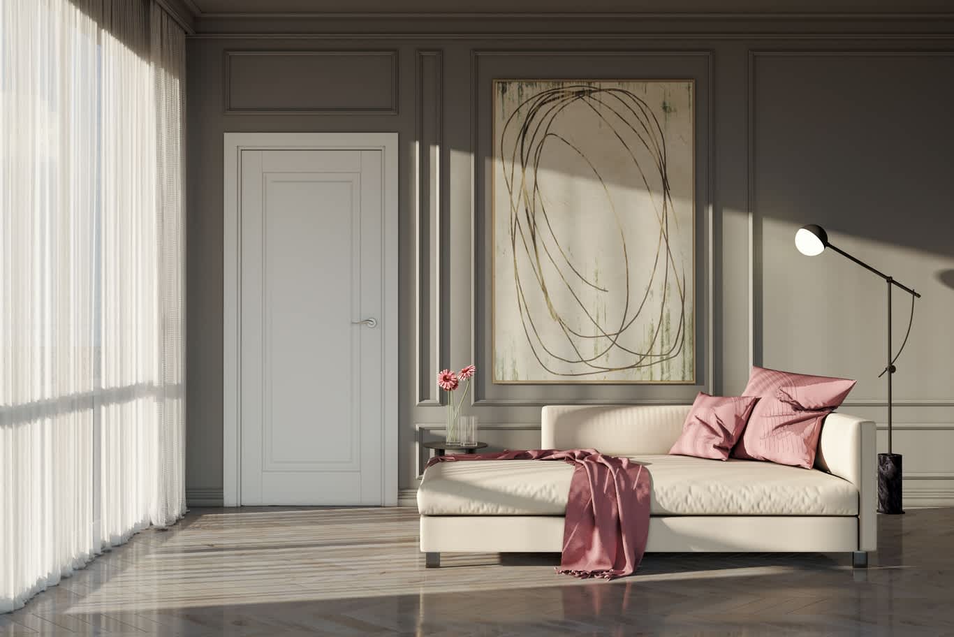
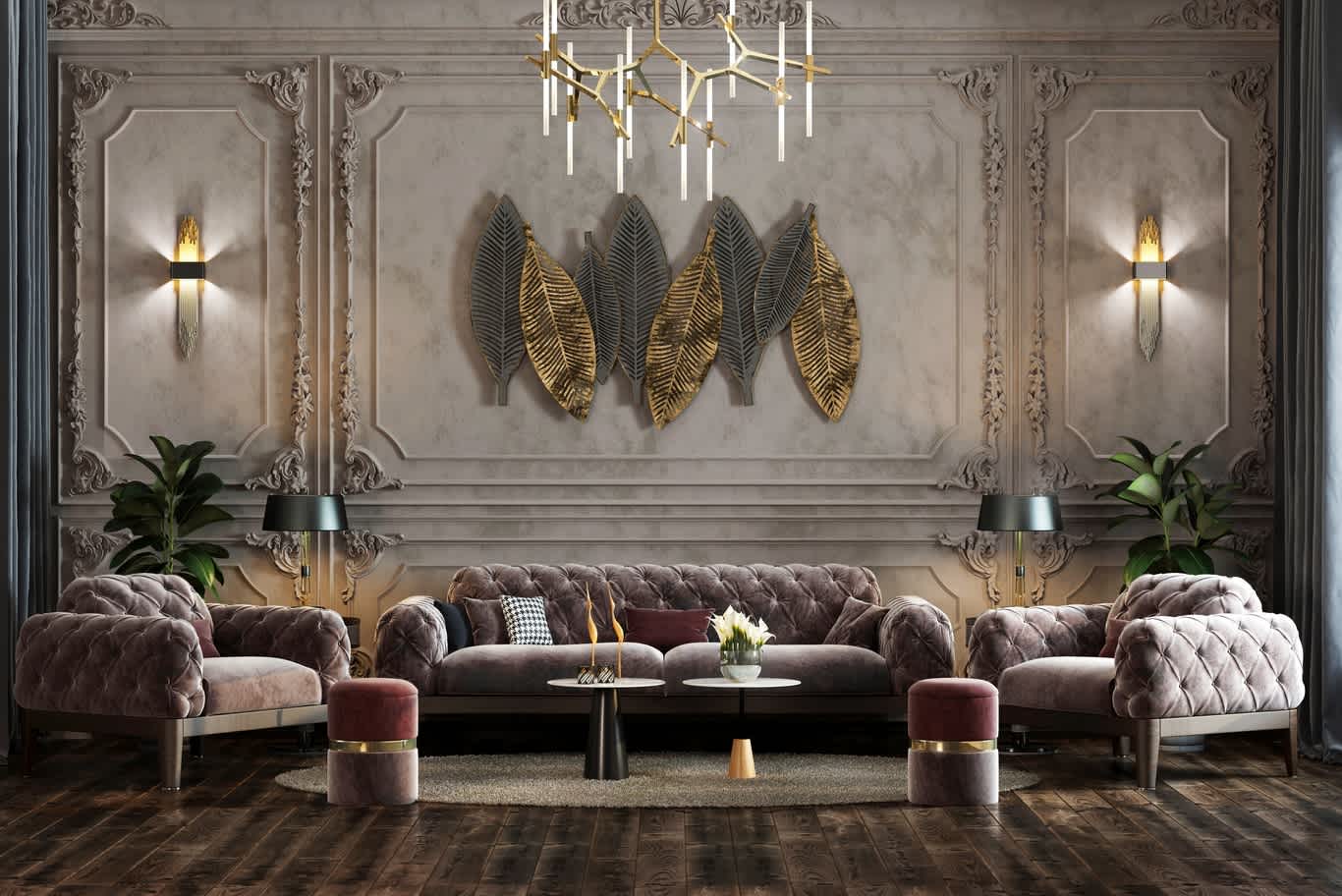
Jewel tones and deep reds make a comeback
While neutrals provide grounding, rich jewel tones bring drama and personality. British wallpaper company Graham & Brown selected Divine Damson, a plum burgundy that evokes sophistication and continues the moody colour trend; Little Greene chose Adventurer, a regal aubergine described by creative director Ruth Mottershead as reassuring and luxurious. Glidden’s Warm Mahogany offers a grounded red‑brown that draws attention yet remains classic. Architectural Digest notes that the popularity of such shades reflects a move away from cool greys toward warmer, lived‑in neutrals. Together, these hues signal a return to jewel‑tone palettes that deliver depth and richness beyond neutrals.
2- Colors That Blend Blue and Green
Hidden Gem and Transformative Teal
Behr’s Hidden Gem is a blue‑green hybrid described as smoky jade. Behr’s research found that a large majority of Americans believe paint colours influence mood and confidence; Hidden Gem aims to create environments that feel grounded and energising while acting as a versatile “new neutral”.
WGSN & Coloro, trend‑forecasting firms widely consulted by product designers, named Transformative Teal their Color of the Year for 2026. The hue blends dark blue and aquatic green, representing ecological responsibility and signalling consumers’ demand for environmental focus. It evokes freshness, calm and restoration and encourages resilience amid climate challenges. Together, Hidden Gem and Transformative Teal highlight the broader move toward fresh blue‑greens that connect interior design with sustainability and nature.
Blues, purples and greens in fashion and paint forecasts
Fashion influences interior palettes, and designers often look to runway reports. The Pantone Fashion Trendsetter report for Autumn/Winter 2025/2026 lists ten standout colours—from Lyons Blue (deep teal) and Lemon Grass (lemon‑infused green) to Damson, Primrose Pink, Winterberry, Hot Chocolate and Poppy Red—while seasonless shades such as Vapor Blue, Crown Blue and Mauve Wine add timeless appeal. These runway colours inform 2026 palettes by adding vibrancy to earthy neutrals and deep reds.
Dunn‑Edwards, a paint brand known for its extensive colour library, released a 2026 Color Trends collection comprising nine trending colours and eight neutrals. The lineup evokes a botanical garden with blues, purples, greens and warm sunset hues. Trending shades include butter yellow (Sonoma Chardonnay), tomato red (Cedar Grove), deep eggplant (Purple Prose) and dark blue‑green (Viridian Odyssey), while lighthearted hues like Gypsum Rose (delicate pink) and Antique Coin (muted grey‑green) balance the richness. The neutrals range from light creams to deeper coffee‑toned hues, providing inspiration and practicality for livable spaces.
3- Other Notable 2026 Color Selections
Beyond the major announcements from Sherwin‑Williams, Behr and other large brands, several smaller companies and niche products are making their own statements for 2026:
• Graham & Brown – Divine Damson and Little Greene – Adventurer: Both British brands embrace deep plum hues. Divine Damson is a dark cherry‑toned plum that adds sophisticated depth to home offices, bars and hallways, while Adventurer is a regal aubergine that serves as a natural progression toward burgundy and other jewel tones.
• Krylon – Matte Coffee Bean and Minwax – Special Walnut: The spray‑paint brand Krylon selected a nearly black brown that adds dimension with natural, grounded allure inspired by clay, wood and stone, ideal for updating furniture or small decor pieces. Minwax, known for wood stains, chose a warm brown tone that highlights wood grain and reflects renewed appreciation for natural materials.
• Dutch Boy – Melodious Ivory and C2 Paint – Epernay: Dutch Boy picked a creamy beige with warm undertones that invites comfort, serves as a neutral backdrop for handmade pieces and pairs well with earthy reds, denim blues and rustic browns. C2 Paint opted for a soft ochre yellow inspired by limestone architecture; it evokes history, art and nature and anchors the En Terre palette.
4- How Designers See 2026
Earthy tones, muddy palettes and no‑regrets accents
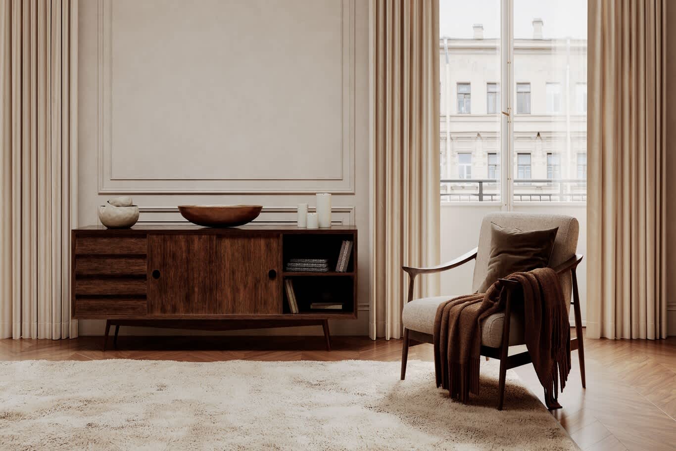
Interior designers surveyed by Veranda magazine predict that earth tones will continue to dominate. They note a shift away from monochromatic greys toward warm shades like terracotta, ochre, olive and deep clay, and emphasise that palettes are becoming muddier rather than bright—featuring olive greens, muted ochres, chalky plums and deep smoky blues. Designers describe these hues as “colours with soul” that appear storied and lived‑in rather than flat, and they highlight that modern browns are warmer and more complex than retro versions.
At the same time, designers anticipate no‑regrets accent colours. Berry tones—rich raspberry, deep plum and soft cranberry—are poised to make bold statements, while acid greens such as Sherwin‑Williams’ Bengal Grass and Benjamin Moore’s Chartreuse provide unexpected pops of confidence. This reflects a growing desire to personalise interiors with vibrant highlights rather than play it safe.
5- Predictions from designers across the South
Designers consulted by Southern Living identify a range of shades they expect to use extensively in 2026, reinforcing the move toward green‑brown hybrids, warm reds and earthy pastels. Picks include Broccoli Brown, a green‑brown that brings an old‑world quality yet feels fresh with modern furniture; Preference Red, a Baroque red with brown and purple undertones ideal for colour‑drenching rooms; Wildwood Crest, a green that dissolves the line between indoors and out; camel‑leather inspired hues like Butterscotch; and soft blushes such as Frolic. These selections highlight designers’ appetite for rich, earthy colours that feel both traditional and current.
6- WGSN’s Key Colours for Autumn/Winter 2026/27
In addition to Transformative Teal, WGSN’s Autumn/Winter 2026/27 forecast introduces four key colours that balance grounded earthiness with playful, futuristic tones: Wax Paper, a creamy yellow near‑neutral that responds to consumers’ desire for sensitivity and nurturing; Fresh Purple, a youthful, energetic purple linking royalty and digital experiences; Cocoa Powder, a rich red‑toned brown celebrating nostalgia and craft; and Green Glow, a bright hue between yellow and green that reflects nocturnal lifestyles and nightlife culture.
Together, these colours broaden the palette for 2026 and beyond, adding fresh energy to established neutrals and jewel tones.
7- Why These Colors Matter: Cultural Drivers Behind 2026’s Palette
Color trends don’t happen in a vacuum; they arise from cultural shifts and consumer behavior. Several themes appear across forecasts:
Return to craft and heritage – Economic uncertainty and a desire for authenticity lead consumers to value handmade goods, vintage craftsmanship and a slower lifestyle. Warm neutrals like Universal Khaki and Melodious Ivory, along with brown stains like Special Walnut, evoke the timelessness of handmade materials; jewel tones like Divine Damson and Adventurer recall historical interiors, and butter yellows and tomato reds in Dunn‑Edwards’ collection nod to vintage kitchens.
Wellness and restorative design – Many 2026 colours aim to create calm, nurturing environments. Warm Eucalyptus and Hidden Gem connect to nature and encourage relaxation; Dunn‑Edwards’ trending palette emphasises quiet joy and botanical inspiration; and WGSN’s Wax Paper provides healing warmth.
Individuality and anti‑trend thinking – Consumers seek colours that reflect personal identity rather than following a prescribed look. Warm Mahogany has been called an “anti‑trend” for those torn between safe neutrals and bold statements, while designers encourage no‑regrets accent colours and brands like Graham & Brown and Little Greene support this desire for self‑expression.
Sustainability and ecological awareness – Blue‑greens like Transformative Teal and Hidden Gem signal ecological consciousness; Green Glow from WGSN echoes the energy of nighttime culture while staying rooted in nature.
Digital and hybrid lifestyles – Colours such as Fresh Purple speak to virtual experiences and the blending of physical and digital worlds; palettes combining earthy neutrals with vibrant brights mirror the hybrid nature of modern life.
8- Putting the Trends Into Practice
How can you incorporate 2026’s colours into your home? Here are some ideas:
Layer neutrals for depth – Use warm neutrals such as Universal Khaki or Melodious Ivory as a base and layer darker neutrals like Matte Coffee Bean or Special Walnut on trim, shelves or cabinetry to create a grounded yet sophisticated backdrop.
Introduce jewel tones in intimate spaces – Choose plum and burgundy shades (Divine Damson, Adventurer or Warm Mahogany) for bedrooms, powder rooms or dining areas where dramatic, cocooning colour can shine. Pair these rich hues with brass hardware and velvet or linen textures for a luxurious feel.
Add blue‑green accents – Incorporate Hidden Gem or Transformative Teal on kitchen islands, bathroom vanities or front doors for a modern pop that still feels soothing. Combine them with natural materials like wood and stone for balance.
Play with botanical palettes – Draw from Dunn‑Edwards’ trending colours and WGSN’s Green Glow to create a garden‑inspired scheme. Mix deep blue‑greens (Viridian Odyssey) and soft pinks (Gypsum Rose) with muted greys and yellows (Antique Coin, Sonoma Chardonnay) for a cheerful yet grounded palette.
Embrace muddyness and no‑regrets accents – Select complex colours—muted olives, ochres, plums or smoky blues—to achieve a lived‑in, timeless feel, then punctuate rooms with berry tones or acid greens for confident highlights.
Mix historical and modern – Pair old‑world hues like Broccoli Brown or Preference Red with clean‑lined modern furniture to juxtapose heritage and contemporary design.
Conclusion
The trending colors of 2026 contains complex hues. They balance comfort and authenticity with bold self‑expression, bridging heritage and innovation. Paint companies are grounding their palettes in warm neutrals, reflecting a cultural return to basics and a desire for restorative spaces. At the same time, jewel tones, blue‑greens and bolder accent colors offer opportunities for individuality and lifestyle.
Designers anticipate that these trends will manifest not as rigid rules but as tools for personal expression. By layering neutrals, embracing muddy hues, and punctuating rooms with daring statements, homeowners can create spaces that feel both timeless and current. As 2026 approaches, think of color as a means to create your own haven; a palette that reflects who you are, what comforts you, and where you hope to go next.
Check out our interior design gallery to find out more!
FREE CONSULTATION
TELL US ABOUT YOUR PROJECT
WE WOULD LOVE TO HEAR FROM YOU
Feel free to reach us via this contact form and one of our Design Consultants will get back to you at earliest.
OUR BRANCHES
UAE - DUBAI
+971 52 8111106 | hello@algedra.ae
TURKEY - ISTANBUL
+90 533 701 89 71 | info@algedra.com.tr
Leading Interior Design and Decor Company in Dubai and Abu Dhabi.
Algedra is a reputable, internationally recognized, and one of the most successful interior design companies in Dubai, and Abu Dhabi, which specializes in delivering interior design, architectural, and creative space planning projects throughout GCC, MENA, North Africa, Turkey and Russia.
Algedra is a one-stop solution for all your residential interior design and fit-out needs. We have successfully completed numerous villa interior and exterior design projects, where we integrated quality and originality to deliver interior masterpieces.
ALGEDRA, Interior Design Company in Dubai, is specialized in providing elegant and stunning interior design services for both residential and commercial projects. We turn our clients' dreams into reality, trans- lating their tastes and needs into beautiful and functional spaces.
Since the day we were founded, we have designed and built many branded residences, resorts, hotels, multi-purpose social spaces, and palace designs with different functions and concepts by following the ever-changing design trends over the world.
A key element of our work is a fusion of different cultures and designs, combining Greek, Italian, Eastern and Western influences with British innovation.
As a team of highly qualified interior designers and engineers, Algedra offers complete architectural services from mall design to corporate office design as well as the exterior design of any project based on customers' needs.
Our customers include leading names, we have completed diverse projects in hospitality, landscape, commercial, and residential designs. These projects contain cafes, restaurants, gym, villas, family sitting rooms, bedrooms, kitchens; all showcasing our company's exquisite details and high-end designs.
Residential Interior Design in Dubai
Algedra's interior designers and architects have an important mission: building villas, houses, apartments, condos, and anywhere else where you reside that will fulfill your needs while being structurally safe and sound.
Architectural Designs
There are so many details that go into designing an architectural design project. Every step of the project has been carefully considered for safety and daily comfort by Algedra's experts.
Commercial Design
Conceptualizing spaces for business, to elevate style, and to increase functionality to help enhance the bottom line of a company is vital, as well as employee comfort and interior design too. Our commercial interior designers translate client's concept in ways that are efficient, attractive and provide professional workspaces.
Fit-out Projects
Algedra Interiors delivering high-quality tailored fit-out projects that transform your villas, palaces and commercial spaces.
We're a passionate team of interior designers, architects and engineers. Every day we help clients to solve interior design problems and create engaging spaces!
Wherever you are in Kuwait, Saudi Arabia, Azerbaijan, Qatar, Morocco, Algeria, Tunisia, Libya, Egypt; don't hesitate, contact us to find out more about why we are one of the best interior design companies in Dubai and Abu Dhabi!